The Ian Fleming 'rebinds' - the continuing story: On Her Majesty's Secret Service
- Peter Crush

- Oct 3, 2025
- 6 min read
Updated: Oct 4, 2025
The 11th book is finally finished . It's good, but if I'm being critical with myself, I think I could have made it slightly better...
In the opening line of On Her Majesty’s Secret Service, Ian Fleming writes: “It was one of those Septembers when it seemed that the summer would never end’.
Well, when I started my project of rebinding the Ian Fleming James Bond books - with the aim of reproducing (with slip case), each of the iconic titles in full-leather, it really did seem like the project would never end.
Each book literally takes months to make – requiring as they do, a lengthy process of briefing an illustrator to design the many custom-made aluminium blocking needed for the gilt transfer onto the leather.
Some to-ing and fro-ing is typically the next phase, as improvements are suggested, and comments on the roughs are made. And that’s not taking into account the time it takes my very busy bookbinder to work his magic.
If I’m lucky, I’ve managed to get two, maximum three done per year – as progress doing them in my previous blogs (see links at the end), have demonstrated.
But, I’m pleased to say, it has indeed been ‘one of those Septembers’, because last week another rebind – yes, it’s On Her Majesty’s Secret Service – was finally completed.
Because I’m doing each book in order in which they were published, it means that with this next book now safely in my collection, the total number of finished books comes to 11.
And so, with just three books remaining (and the 12th is already in production), the light is now very visible at the end of the tunnel. I’m trying to ramp things up to try and finish the set as soon as possible.
My quest to redesign each book, to the exact design of each of the original covers is now, very (very) nearly complete.
My rebinds:
Those who have read my previous blogs will know the drill.

The aim for all of them is to reproduce the front covers, as well as the cover typefaces, so that the rebinds look, for all intents and purposes, like the originals – but as leather versions.
Along the way, I’ve introduced highlights where I think they’ve deserved it, in the form of a second foil colour - red (see Thunderball, pic to the left).
They require an extra third block to be designed, tooled, and then pressed (with some considerable expertise lining up the second colour on top of the existing gilt). As a result of the extra cost and time involved, third blocks tend to get used sparingly.
But I think that where they have been used, they very effectively pick out red in the jacket designs of Casino Royale, Goldfinger, Thunderball (above left) and The Spy Who Loved Me.
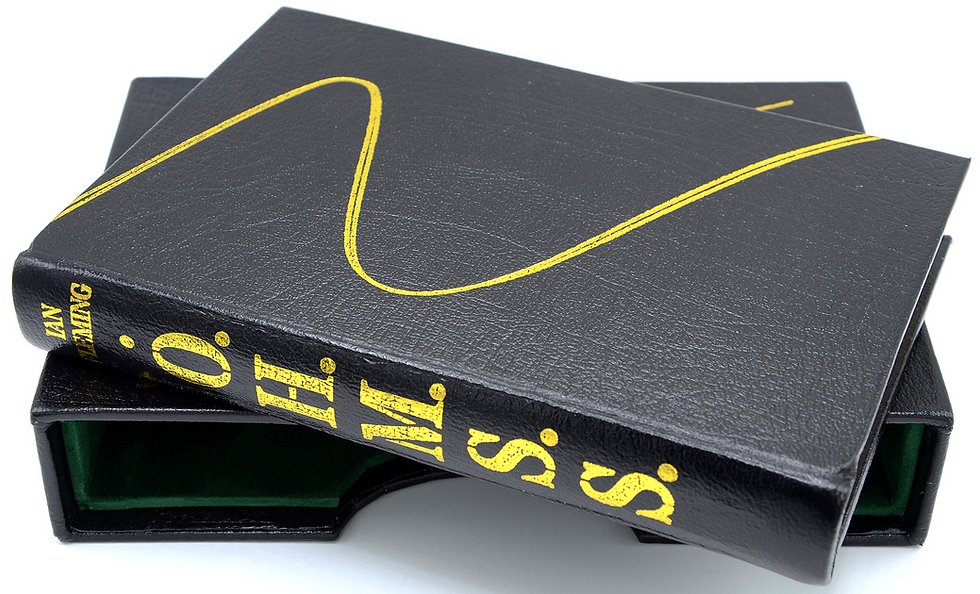
So, here’s my latest completed book:


You might well notice the 'boards' on this particular new book.
When I introduced red into the design of my Casino Royale rebind, I also decided (for the first time), to add the single red ‘heart’ too (see pic below) – so that the book inside of the slipcase resembled the front board of the original Jonathan Cape book (with slipcase then doubling as the jacket):

This was a departure from the norm. Until the red version of Casino Royale (about five books in), each book (inside the slipcase) had been designed to have the same dust-jacket image that is found on the slipcase.
The rationale for using the same design across both the book and the slipcase was so that - on display - the slipcases would resemble a line of books on the shelf - showing the DJ design. Then, when the inner book was pulled out, the book in one's hand would resemble a normal book (ie jacketed).
Oh, and yes, cost was an issue, Much as it would have been nice to have the same motifs as each of the books have on their boards, the cost of doing so would start to stack up.

However, you’ll see from my pictures above, that for this book, I decided to follow the example of Casino Royale, and introduce the ‘ski-swish’ to the book, and keep the DJ design just on the slipcase.

I debated long and hard whether to do this at all, since Casino Royale was the only other example so far.
But in the end I thought this book deserved it – both to keep the set feeling fresh, but also because the limited edition signed On Her Majesty’s Secret Service was also effectively jacketless (save for a transparent glassine sleeve) – meaning this particular title has a precedence of being displayed with just with the ski-lines design (see left).
Because all the other books have been detailed in gilt, I decided to use gilt rather than silver (or white, as per the original Jonathan Cape book).
In all other respects, the book is essentially the same in the way it’s been designed and made, with a handsome green-felt slipcase, and spine lettering on both the spine of the book and spine of the slipcase.
My thoughts….
As ever, I welcome your comments on how this book has been done.
For my part, I’m generally happy with the results, and think this sits very well with the rest of the set. But I’m going to be honest and say I think that on this occasion I could have done better.
It’s not that the finish is different, or the detail of the image is any worse, but I’m a little disappointed with myself.
I’m usually extremely pleased with what I’ve achieved, but as soon as I saw this one, my mind immediately thought that what I should have done was have the ‘rubber stamp’ image of the book title in red foil. This would have perfectly lifted the cover into being a much better book. It’s the perfect place for having a hint of red, and I should probably have got this block made as my additional block rather than the ski-tramlines.
Honestly though, throughout the entire design stage, I didn’t even give this a moment’s consideration.
It was only on seeing the finished product that this (to me), glaring omission presented itself.
Did I drop the ball?
Maybe I’m being hard on myself. Maybe in the sprint to get the last ones done, I didn’t think about this as carefully as I could have. For this I’m a little disappointed in myself.
With only You Only Live Twice, The Man With The Golden Gun, and Octopussy & The Living Daylights left to do, there won’t be the opportunity to use another foil as a highlight.
And these last three easily have the most complex jacket designs, which will present their own problems in getting the right level of reproduction right.
But what do you think?
It’s possible I’m being a little critical on myself.
I didn’t use a red foil accent From Russia With Love either (that book was made very early on in the process, before the idea of even using a second colour came to me) – but given From Russia With Love has a red rose on the cover, this would have also made this book a very good candidate for a red highlight.


All the other flowers featured on the Bon book covers (the rose on the cover of Goldfinger, and the carnation on The Spy Who Loved Me), do have been picked out in red - as by then I could see the value in doing it (see above).
I guess having little irregularities just shows what can happen when you’re producing the books over such a long time-frame (I think the first rebind in the series was easily more than five years ago). Over that time, ideas come and go, and improvements are made.
I’m pleased with On Her Majesty’s Secret Service, but could it have been even better?
Yes, probably.
Maybe – even when my project is technically finished, I might have to address this omissions by re-doing this book, and From Russia With Love.
The chase for perfection can sometimes be an annoying pursuit!


Comments