The Toby MacFarlan Pond interview: Pt 1
- Peter Crush

- Oct 29, 2025
- 5 min read
In 2002 British-born still-life photographer, Toby MacFarlan Pond, took images that would appear on what has always been one of the most daring and experimental sets of James Bond books. We take a look into this often forgotten about set, and next week we reveal the full story behind the creative process from the very man himself...
Twenty-three years ago (in 2002), a brand new set of James Bond books were released in the UK: a full 14-book set published by Viking/Penguin.
Released on 4th April, and looking unlike anything that had previously come before it, these books have always been rather enigmatic, slightly devoid of much information about them, and also something of a head-scratcher in more ways than one.
For starters, this set is referred to as the ‘Anniversary Edition’.
But the anniversary is itself an odd one, celebrating as it does, 50 years since Casino Royale was completed – ie written – (in 1952), rather than the 50 years since its publication in 1953. Like I say. A bit… odd.
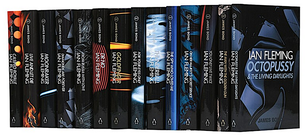
Then there’s the imagery itself (see montage below).
In a clear departure from previous Bond covers, these dark, slightly menacing, covers were captured by Toby MacFarlan Pond – a well-known still-life photographer who at the time was more used to shooting Gucci handbags for Vogue and Arena than doing book covers.


And finally, there’s the print-run of these books themselves.
This set comprised a hardback set of just 1,000 copies (RRP £17.99 each, so not cheap for back then) – tiny by any standard, especially as they were not advertised as a limited edition set.
And the problem was, most never even saw booksellers' shelves - with the majority ending up going straight into the library system (sets not with library stamps are very rare indeed). Again, it's odd.
Surely, if Penguin/Viking were serious about re-launching a bold new set of books to a noughties Bond-reading market, one would have imagined a far more ambitious print-run would have been opted-for. Remember, Brosnan was still riding high, and set to star in Die Another Day, later in the same year. A larger run would surely have been sensible, if only to cover the production/photography costs and give the publisher a bit of profit on the side.
Alongside this, paperbacks of each novel were printed, but in differing – also limited numbers (believed to be between 5,000 to 8,500 copies) – initially priced at £5.99 later rising to £7.99).
Completing the run, there was also a limited edition box-set limited to 2,000 copies (£70). This was sold exclusively through former high-street chain, Past Times.
But thereafter, the information trail about this set goes completely cold.
The 'curious' set
Compared to a lot of the other Ian Fleming James Bond sets out there, this is a set of book we know almost nothing about (Not even Gilbert adds any more information).
Yet I’ve always felt this is a shame.
Because, in more ways than one, this collection of Bond titles is actually monumental – yet it remains a very under-appreciated one.
For instance, this set actually represents the ‘very first’ time all 14 books were available to be sold all-together in a single, combined set. Yes, you read correctly.
This is actually quite remarkable when you think about it.
All the previous titles had to be bought individually, and had to be compiled over a period of time (with some sets not even completed).
This set – giving collectors every James Bond title at the same time – was a true first, and it became the template for all the other complete sets that followed – from the ‘Centenary’ set coming a few years later in 2008 (celebrating 100 years since Fleming’s birth), to the recent Ian Fleming Publications set – both of which had covers designed by Michael Gillette.
But more than all this, I think this set is an important one to recognise because it’s a visually dramatic, and very bold and experimental one.


As the above and below covers show, the images used are abstract, some might say slightly unclear, with some featuring no immediately obvious visual clues that identify the image, or even link it to the book itself.
It’s undeniably a very daring approach for such an iconic collection of novels, and where historically, familiarity has been the creative direction of choice. These books dispense with this maxim, forcing you to have to ‘work-out’ what the images are (if you can) – and they eschew instant association for something far more abstract.


So why was this very different visual route chosen?
To me, there’s only one way to really find out – and that’s by speaking to MacFarlan Pond himself, to explain the creative direction he/the publishers decided to take.
And www.jamesbondfirsteditions.co.uk is pleased to say that we’ve done just this!
For beyond a 2002 (and very limited) interview he did for French magazine NUMERO HOMME (alongside Kate Grimond, Fleming’s niece), to promote the new books, MacFarlan Pond has never (to my knowledge), ever spoken in print about the creative decisions that surrounded this elusive set.
In fact NUMERO HOMME was pretty scant on detail, opting instead to mainly showcase the interesting covers.
A quick quote here and there was all we got – with him simply saying that he looked for: “for quite dark images because the novels have a much more macabre side than the Bond films,” and that: “I let inspiration come without worrying too much about the specific details of each story.”
Well, that’s all about to change.
www.jamesbondfirsteditions.co.uk decided it was time to find more out about this curious set, by hearing directly from the man behind these malevolent images.

In the same way we spoke to Michael Gillette, I recently talked to British-born MacFarlan Pond, now based in the US.
Nearly a quarter of a century since he first got involved with the project, he has spoken exclusively about the creative process he took to start to build this sometimes forgotten-about set.
Interestingly, he says he wanted his images to “create a feeling or a mood” rather than give the casual book browser something very obviously clear cut.
So what else did he reveal?
Well, I’m afraid I'm going to tease you by saying that if you want to hear more, please come back next week, when I’ll publish our full Q&A.
With this week acting as the scene-setter to introduce this set, next week is when I share MacFarlan Pond's full reminiscences!
But, before then, I’ve got something rather special to share.
To get you into the mood, below are some remarkable images of the original Polaroids that Toby MacFarlan Pond shot for the project.
They're a selection of some of the original test shots he took.
These are images never-before-shared outside of his immediate peer-group, and he has shared them exclusively with me (and you!)
Enjoy! And make sure you come back next week!
For Your Eyes Only:

Dr No:

Thunderball:


Comments