Dust jacket colours: Seeing 'is' believing
- Peter Crush

- 17 hours ago
- 7 min read
Can the colours of certain James Bond first editions look too good to be true? Possibly!

Lately I've been ever-so-slightly preoccupied with the colour red.
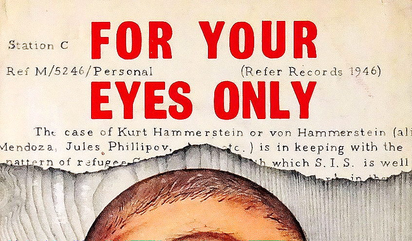
Because when it comes to obtaining copies of For Your Eyes Only, it's finding them with jackets that have red spine lettering (rather than sun-faded orange and yellow), that seems to be most difficult. (See my analysis of surviving numbers of ‘near fine-to fine’ examples).
But it was while researching last week's survival rates blog that I had direct experience of something that has recently started to irk me: receiving a book that (in the flesh) looks nothing like what the seller's pictures showed them as.
When I received a copy of For Your Eyes Only, the bright red-lettering I was expecting looked very different indeed.
Here’s the proof
Directly below is a picture of what looked like a fantastic example of the said For Your Eyes Only – one with really nice looking ‘red’ lettering to the spine of the dust-jacket.

I purchased it, and was looking forward to its arrival. When it got to me, however, I was immediately disappointed.
Below is a picture I took holding up the exact-same book in front of my computer screen showing the book above.

Differences, differences
I think we can all agree that the red spine that I thought I was buying was not red at all.
To my eyes, it’s nowhere near being red at all. I regard this a much more orange in colour.
The scourge of photo editing:
While I’ve previously blogged about how written descriptions of books can often vary considerably, buyers can usually be rest assured that any overly ambitious descriptions will be found out by actually looking at pictures of the book itself.
Pictures 'should' show books warts and all, and usually, if a book is bad, it photographs bad, and there’s not a lot that can be done to change that.
But…!
Lately I have noticed what looks like increasingly use of photographic editing and manipulation of pictures, where sellers – keen to showcase their books in the best possible way – get carried away with the picture refining software.
Using tech to sharpen up a picture is something I haven’t got a problem with. This tool will usually ‘reveal’ flaws that might previously have been difficult to notice, and it aids showing a book how it will actually be seen by buyers.
But in chasing making a book look the best it can, I’ve long suspected that it’s contrast settings in particular – which can either dial-up or dial-down the vibrancy of a colour palette – that are now being experimented with, and to the extent that they’re misleading viewers about how a book actually looks in reality.
I think sellers are getting a bit handy with their contrast settings - including making orange-looking spines appear more ‘red’ than they normally are.
My message...
What I don’t want to do is to suggest that all sellers are looking to deceive.
But what maybe what I do want to say is that in the pursuit of making them appear as good as they can, it’s easier than you might think to beef up the colour settings and make a jacket look more vibrant, or deeply-coloured than it really is.
For this reason alone, it’s worth being on your guard.
Here's four books you might want to watch out for:
Vigilance is, of course, the key, and of the 14 Ian Fleming books, I think there are a few where it’s definitely worth being 'more' cautious about:
1) For Your Eyes Only: For all the reasons pointed out above, it’s a lot easier to make orange look red by altering the brightness and contrast needles on photo editing software.
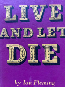
2) Live and Let Die:
This might not be an obvious choice, but the predominantly magenta/purple design of the dust-jacket is actually quite hard for camera sensors to pick up with accuracy. In photography circles (particularly amongst those that take photos of flowers), it's well known that digital camera sensors have a notoriously difficult time seeing, rendering and processing the colour purple. It’s often attributed to he color purple itself being made up of red and blue, two colors on opposite ends of the color spectrum and digital sensors.
More specifically, digital cameras are said to be physically blind to the "red" part of that purple light. Their sensors lack the specific "red cone" sensitivity of the human eye, causing them to misinterpret "spectral violet" light as pure, electric blue.
Many photos of books are taken with iPhones, which have just the same problem, and it's with Live and Let Die that we can see how the same book can look very different – even with shots taken straight after each other. When taken up close, the colour can swamp the sensor and sent it into a bit of a spasm. Pull back, showing more of a background colour, and the same book can literally seem to change colour.
If you don't believe me, have a look at the below photos. Same book, all taken within a few seconds of each-other. All with very different colours:


Above: The same book, with three very different looking jacket colours
3) Moonraker:

Collectors covet copies of Moonraker where the yellow ‘flames’ depicted on the dust jacket have not faded into nothing.
As such, in photo editing suites, sellers can be tempted to either try and boost the yellow content by moving the contrast slider, or making the orange flames appear brighter and more defined.
To show you how images can be altered, left is a picture I took of an example of Moonraker - uploaded as it was without any editing.
Below are some photos of the 'same' book, after messing around with the colour balance settings:


To make the yellow stand out more, changing the brightness in combination with amplifying the shadows and adding a small bit of contrast created the above image. Remember, this is exactly the same book.


In the example above, we can see just how dramatically the look of the book can be altered by changing the settings again - this time turning up the colour contrast, to really make the orange look deeper.
Top Tip: Look for where the yellow looks unnaturally yellow. A broad-brush photo editing tool won’t be able to differentiate between the yellow and oranges, and so if anyone has changed the contrast, it will affect both colours, and more-so the orange.
4) Diamonds Are Forever:
Being predominantly ‘black’, one might think this book has a fairly stable colour base.
But the dominance of black can be its downfall. Black actually shows up scratches and abrasions and marks quite easily (just ask anyone who has a black car), and it’s very easy on photo software to amplify the ‘blackness’ to try and hide all any imperfections, and just make them blend into the surrounding blackness. There can also be a temptation to boost the orange of the woman, to make it bolder-looking than it really is.
Have a look at the pictures below of a recent listing for a first impression of Diamonds Are Forever on eBay. The image on the left is, I would say, authentically photographed.
But if you wanted to make it 'pop' - with the orange looking deeper, the black more dense, and the pink lettering more vibrant - it can be manipulated to make it look 'better' - see picture, right:


Top Tip: If a basic contrast-changing tool has been used to try and blacken the book as a whole (ie where the tool changes the whole image, rather than isolating a specific area), it will unavoidably make the orange more vivid at the same time. A tell–tale spot is if the orange now looks ‘too orange’ – ie beyond what it should do in reality. In general, for this title, it's a good idea to get to know the type of hue a first edition of this book has. But remember too that in later printings of this book, the orange ‘does’ get deeper anyway, so this advice applies only to first impression books, or very early editions).
What jamesbondfirsteditions.co.uk does:

It's really quite easy for our eyes to fool us when there are limited reference points. Without questioning it, we also use context to inform our colour experiences. Here our brain is trying to work things out based on what it can see.
It explains why in our minds, we see panels A and B in the picture above as being different.
But actually, they are exactly the same shade of grey.

Colours next to each other have the same impact.
Squares A, B and C appear to be different shades of brown.
Cover the surrounding squares however, and you’ll see they are in fact the same colour.
How we take our pictures:
Those of you who are familiar with jamesbondfirsteditions.co.uk will know that accuracy in our descriptions is our upmost priority.
We carefully describe books, but because we also realise that photos often much of the talking too, they must ‘speak’ to people who look at the site accurate too.
All of our books are photographed – with a professional digital camera (a Nikon D7000), in exactly the same way, to maintain consistency.
They are stood up or laid flat in a mini, table-top studio, which features an internal white infinity curve with reflective (metallic foil) sides to bounce light equally.
Light is shone from above, and a white light (rather than a yellow or blue’ish light), is chosen to most accurately present the book as it stands.

Each book is photographed at 80 ASA, with a shutter speed of 1/125th of a second at an F-stop of usually 14 or 16 to ensure all of the book is in focus.
Photos are uploading directly to Wix (which manages this site), and are imported as are, without just minor editing, such as fixing angles if the book doesn’t stand exactly straight.
Do I colour-correct? The only editing I do, is to sharpen the image (which actually shows any flaws more readily), and I occasionally I change the brightness – more to whiten the background, as sometimes it can actually photograph with a slight blue hue to it.
If I do encounter examples where I think the camera hasn’t captured colours I accurately as I think they look to the naked eye – such as with a Live and Let Die – I ‘will’ see if this can be corrected – but only to bring the book to resembling how it looks to my own eye, and without trying to falsify or artificially enhance any colours.
In the flesh, the books you look at on jamesbondfirsteditions will look exactly as they do in the photos. This is our promise.


Comments