The Toby MacFarlan Pond interview Pt: 2
- Peter Crush

- Nov 6, 2025
- 8 min read
Updated: Nov 8, 2025
Last week we introduced the often-forgotten about 'Anniversary' set of James Bond books. This week I exclusively talk to the man who actually shot these iconic covers:

Images kindly reproduced from the 007 Files - see here for more
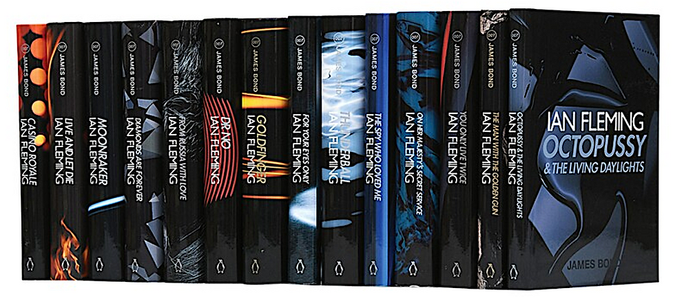
Last week www.jamesbondfirsteditions.co.uk introduced you to a set of James Bond books that often fail to make it onto people’s immediate consciousness when asked to think about iconic Bond book sets.
With Michael Gillette’s two separate sets often claiming top recall spots for many, the ‘Anniversary’ set we’ve been talking about last week and this week often fails to get a look-in.
And, as I said last time – this is a great shame.
Why?

Well it’s a set of ‘firsts’ for lots of reasons:
It was the first time the entire Fleming collection could be bought at once, setting the precedence that others followed.
I’ve also been told (since publishing last week’s blog), that this was also the first set to have the short story ‘007 In New York’ added to Octopussy & The Living Daylights.
But much more than this, I would argue, is that it’s a set that – design-wise – really defies convention up until that point.
Highly abstract and experimental, it’s a set that is dark, and brooding, and slightly disorientating to look at.
It shuns fast identification, and actually forces the book browser to try and define the image in front of them. And often (I would argue), one cannot.
The visual clues don’t always seem to match with our recollection of what each novel is about.
But, abstract though it is, this set deserves its rightful place as one of the most defining Bond book sets.
My appreciation of the artistry of covers has grown just in the course of writing these blogs.
I think the reason this set doesn’t often register for many has less to do with its bold imagery (which can admittedly create a love it or hate it response), and everything to do with the fact this was such a limited print-run set (only 1,000 hardcovers - most of which went to libraries).
To me, the simple fact is, a lot of people just won’t have seen it.
But let’s get back to the imagery itself.
Last week I promised the first in-depth discussion with Toby MacFarlan Pond – the still-life photographer charged with creating these arresting front covers.
We teased a few of the Polaroid test shots, and below, we show some more. But before all that, I think it's finally time to talk to the man who shot these covers.
How exactly did they come about – and from who did he take direction (if at all)?
Well, those of you who have been waiting for these answers have arguably been waiting long enough.
So here we go…
Q: Toby, I think lots of people will be fascinated to find out how you even got involved in this project. Can you give us a steer on what happened? Did you approach the publisher or did they approach you?

A: “The publisher approached me. At the time, I was doing a lot of editorial work for magazines like The Face, Dazed & Confused, Arena Homme +, Vogue Homme International, and quite a few French magazines, including the likes of Mixte and L’official. I was also working quite a lot in the music industry, doing a lot of record covers. As well as being immensely enjoyable both avenues were a good way for me to get my name out there, and I must have caught the eye of Edward Bettison, the creative [deputy art director] at Penguin.
"He was then, and still is, a lovely man. I’d never worked for Penguin before or indeed done a set of jackets and I simply got a call to see if I would be interested. It remember thinking how exciting it was to be asked by Edward to collaborate on such a project.”
Q: What was the brief you were given then? Did the publishers already have a set idea of how they wanted these books to look, or did you lead them with your own ideas?
A: “Edward did want me to do something abstract. If I remember correctly, something atmospheric and textural. I really just thought about the books and experimented with different ideas and discussed these with Edward. It’s always a very collaborative process.”
Q: The abstract look that was eventually decided on; was this your idea and if so, how did you sell it to Penguin?
A: “No selling was really needed at all. Edward had a strong sense of what he was looking for and it just clicked.”
Q: Did you read the books to get a flavour of what sort of cover image to try and go for?
A: “The stories just threw up ideas or images to me which Edward and I explored and discussed. You have to remember, James Bond is such a cultural moment for everyone; it was a part of my life growing up with my parents.”
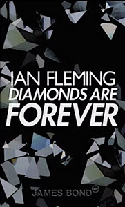
Q: Some of images for the books are very obvious - Diamonds are Forever – Diamonds; Thunderball – water; Dr No – a Geiger counter-looking watch (I think). But some of the others are definitely more abstract. Was this deliberate, because people can interpret them quite differently?
A: “It wasn’t deliberate. The final pictures are the end of the process. The pictures were simply where we ended up. They were what we both felt was right or what felt right to me.
"One of the lovely things about the project was that I had time to explore ideas. I could do something, think about it, then discuss and then return to it. It’s interesting you mention Dr No, because this was a tile which exemplifies doing something that suggests something.


"In actual fact, Dr No wasn’t a picture of a watch.
"It was actually a close up picture of a 1960s Fresnel glass lens – from an old film spotlight (see pic).
"I felt it had the right amount of menace.
"I think its nice to interpret them how you want!
"The images are more suggestive of a feeling or mood then actually what it is. I think I like the idea of the cover suggesting an emotion; something atmospheric.”
Q: What did you actually photograph for the rest of these books? From Russia With Love looks like a mink/fur coat, but now I’m not so sure about the rest! Lots of the images – such as those for The Spy Who Loved Me; You Only Live Twice; Goldfinger and For Your Eyes Only aren't easy for to identify. The same goes for OHMSS and Octopussy. Can you explain?
A: “Aha that would be telling!

"OK... Well a lot of the images were of things I either picked or found. I thought it would be nice if they were objects from the mid century, from a past time to be in keeping with the books.
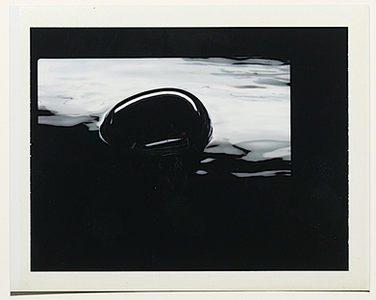
"For instance as I previously mentioned the Fresnel glass was from a 60s light. For Thunderball (left), the dangerous object in the water is actually a mid century chrome soap dispenser!”

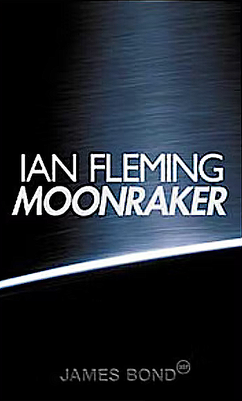
“For the cover of Moonraker I wanted it to create the feel of something NASA would have built – something like machinery, that is highly finished.
"I was looking for really well-machined brushed metal and it just so happened that a salad bowl designed by the Danish designer, Arne Jacobsen, in 1967 was perfect.”
“Octopussy was an exploration of clear Perspex blocks with water.”


"You Only Live Twice was as simple as the two red lines, as in ‘twice’.
They were actually reflections of a red light in an Alvar Aalto glass vase.
See pic, (left).
"Again I was thinking about good design in that period of time.”


"From Russia With Love was indeed a fur."
“Goldfinger was painting with light.”
“On Her Majesty’s Secret Service’ was details of ice in a glass.”
“The Spy Who Loved Me was a lateral movement of the reflections from a sequined dress.”
“Once I’d sort of established in my head the kind of world the images lived in, it was really just a case about being about things just fitting in.”
Q: Roughly how long did each set-up take, and how many pictures did you need to take to get the perfect shot? Was this more arduous than other still life work you've done?
A: “This work was not arduous at all! This is my fun. it really didn’t to take long. You sort of get into the flow of the work once you have the right mindset in place. As I said, I knew what we were looking for, and I had a view or sense of the world that these images lived in.”
Q: Were these books hard to photograph? I’m assuming it was pre-digital, and all in-camera?
A: “They were not at all. It was a complete pleasure. It was all in-camera all pre-digital and shot on film/transparencies. It was kind of the world I was inhabiting at the time so it was very second-nature for me. I have always enjoyed experimenting. Once I get a idea of the kind of image I want to make, it’s just a process of getting there. love the actual work involved. It’s a journey. I also really liked the collaborative aspect not working in a vacuum.”
Q: What are your thoughts looking back on them now, more than two decades later. I think they stand up really well, do you?
A: “I m very proud of them. I think they’re a good example of my work at the time. They look nice and complete. It’s great when you get such an open brief and work with people like Edward and the Fleming family. They were really great. They trusted me – which is all you can really ask for. One of the nice things about photography, or indeed any other creative process, is that you have a record of your history. I was here doing this at such a time.”
Q: Would you ever want to do something like this again!!
A: “Absolutely!”
The test shots....
Below are some exclusive examples of some test Polaroids that Toby created. See how they compare to the finished books...
Dr No:


Goldfinger:


Thunderball:


For Your Eyes Only:


Diamonds Are Forever:


And here's two that didn't make the grade:

The image above was, I believe, an early treatment for Casino Royale
The image below was, I believe, an early treatment for Octopussy & The Living Daylights:

And finally...
If you have this collection, the eagle-eyed amongst you might have noticed that on two of the books, there is something of a 'hidden' feature.
On Goldfinger and The Man With The Golden Gun - two books that include the word: 'Gold' - there is extra gold detailing on each of these books on the spine.
See picture below:

As can clearly be seen, all the other titles are printed in white ink, but where there is 'Goldfinger' or 'Golden' in the title, it's printed in a yellow/gold colour. A nice (and clever) little Easter egg I think!
WE HAVE A SET FOR SALE!
If you would like to purchase a set of the Anniversary hardbacks, there were only 1,000 complete sets printed. Many went to libraries - making these books very rare now.
www.jamesbondfirsteditions.co.uk has a mint condition hardback set for sale - which are NOT ex-library books - making this set very uncommon!
If you would like to see pictures, and want more details of it, do get in touch at enquiries@jamesbondfirsteditions.co.uk
Comments